|
|
Visualizing NOAA NCEP/NCAR reanalysis data
We all know it is bad, really bad
Most have come to accept the fact that it is getting warmer. Not all believe in
who is responsible. But we will not go into that discussion here. I've had a
significant feeling that the last 20 years have been rather exceptional,
temperature-wise, just where I live and many other places too. Most have seen
all those animations what will happen some time in the future (2050+ etc). But,
what about now? What does the current data actually show us?Latest global video: 2026-Mar-10 17:28
Latest lattitude image: 2026-Mar-10 17:02
There are several research institutions who have whole datasets available for any one who wants to check and see the factual data. However, it is one thing to have access to the data. It is a completely different thing to make sens out of the data and visualize it properly. So, lets see if the feeling can be confirmed by looking at the historical and current data. 
It is hot, very hot indeed. So, what will we need?
The noaadata program takes the raw data and calculates an average for each grid-point over a set of years (30 by default). Then, for each 365 day window in the whole data set, an average for that day-set is calculated and compared to the long-term average. The result is saved into a .ppm-image for later processing. The qannotate program takes all the .ppm-images and scales them to a larger version. An overlay of the world-map is drawn on top and the image is annotated with text and a color-scale. The result is saved as a .png-image. Please note that these programs are a bit of a code-a-hack-quickly for this specific purpose. They function but have not been tested much outside the parameters required for this article. The annotate program exists because it turned out to be too slow to run ImageMagick's convert on the more than 26000 images individually. The programs noaadata and qannotate must be build from the custom software to get started. The tar file has a directory structure for data-purposes. Get the raw data and put in noaa_air_2m/. Then, the procedure is as follows:
The result is quite impressive as shown below. The temperature color-scale is such that all temperatures from -0.5 °C up to +0.5 °C are mapped to white. Cooler goes into blue and warmer into red. Direct video links: and mp4 format. And then... About from year 2000 and on it gets really interesting. The heating starts to show very significantly at the poles (both north and south). Additionally, another disturbing observation is that the oceans start to show up in the red beyond ENSO. One may now suggest that the baseline 30 year average from 1948-1977 is not good. Well then, lets take the baseline average from all 73 whole-year files available from 1948-2020. The effect will be a slightly higher baseline average and the warming of the last 20 years (2000..2020) may be less pronounced. That has been done in the following video: Direct video links: and mp4 format. Yes, the early years look a bit colder, on average. However, it still shows the very significant changes from 2000 and beyond. So, the average is not the problem. If we were to exclude the last 20 years from the average, then the result would be more fair, but the conclusion would again be the same. It is getting hot and it is getting really hot fast since the last 20 years. It looks like the warming is accelerating. Especially the poles are at the sweating point. The fact that the oceans are showing a lot of high temperatures outside of ENSO is a clear indication that it will not get cool anytime soon. The energy now in the massive volume of water will take many years to dissipate again. And then, living at 3 m above sea-level may soon not be enough (I may die of old(er) age before I drown, but still). There you have it. My initial feeling that the last years were exceptional is confirmed. Well, it was already clear from the meteorological record. Almost all of the warmest years are clustering in the years since 2000. Seeing it in a video makes it just clearer. [update 2021-01-31] Updated some small text stuff in scripts and programs. Added the ability to do less than 365 day averages on run. Doing 270 and 90 day moving averages shows seasonal changes nicely and show worrying trends in winter. See below for some of those results. The below video shows that the polar changes are also significantly impacting winter in specific areas (less cold than it should be). Especially the Barents Sea is changing rapidly and a worrying trend starts to show from 2005, where the Barents Sea in winter is showing hotter than the 30 year average. Direct video links: and mp4 format. The changes are extreme and can also be seen when a 90 day moving average is calculated. There are patches in the Arctic that regularly are very hot in winter. Again, the Barents Sea is showing more and more often higher than yearly average temperatures in winter. Sure, some winters not as extreme as others, but you may do your own statistics. The warmer winters show up more regularly now. Note that the same temperature scale is used in all videos and all values are simply limited at the ±10 °C range (colder or warmer will simply be shown at the scale's edge). The polar regions have very large temperature swings between the seasons, normally in the order of ±25 °C or more. Therefore, showing a movement from blue into red during winter probably indicates a rather large change. When that starts to happen on a regular basis, then, I guess, "worry" should be your first reaction. Direct video links: and mp4 format. [update 2021-02-05] A static method of visualization can be used to show the dramatic changes at the poles and other places. The same averages as above are calculated, that is, the 365 day moving average difference from the 30 year baseline. But then averages on the latitudes are calculated. The result is a single line for each day of the year with the ends of the line being the poles. If the changes were not clear from the video then this image may show the very significant changes very clearly. Please note that the color-scale in the image is ±6.0 °C and the center ±0.1 °C mapped to white for visual clarity. The actual data varies between -2.87…5.94 °C. 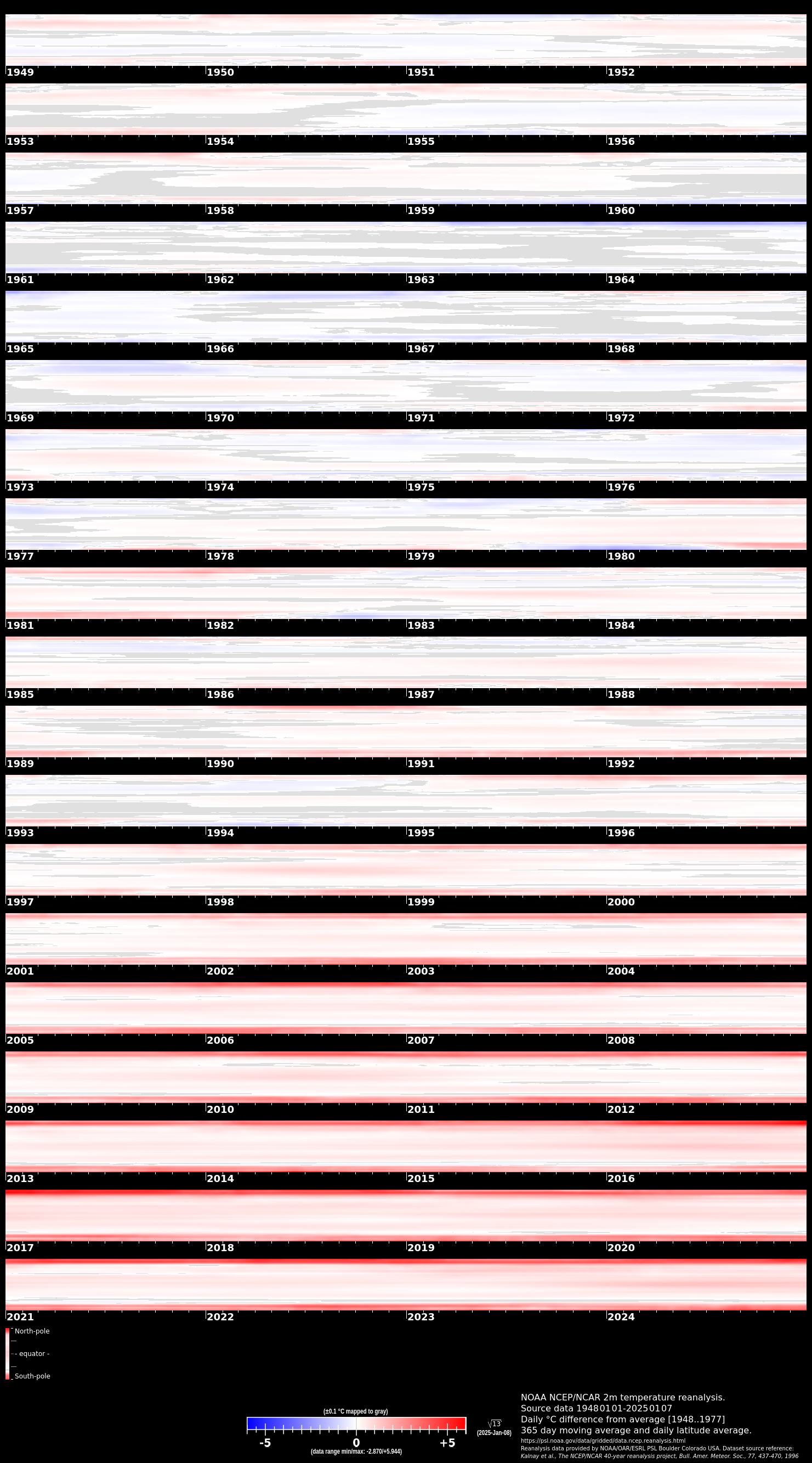
Latitude average for each day from 01-Jan-1949 (update once in a while to current date). (click on image for large version) [update 2021-02-19] Added correct citation to the video and images per NOAA PSL website's guidelines. Updated the software to create citation and include generating the latitude-average image.
Posted: 2021-01-24 |
| Overengineering @ request | Prutsen & Pielen since 1982 |